
 With more people reading Mingtiandi these days (nearly 800 of you per day this month – thanks) I’ve put some effort and a bit of cash into updating the look of the site as well as the newsletters. The goal of all of this new design is just to try to have our appearance keep up with our audience.
The new header image, logo and (at least slightly colors) are complete today, and I hope it will make the site more attractive, easier to read, and maybe help you to overlook a few of my typos.
The new logo is meant to depict the “M” of Mingtiandi, which carries over from the old visual identity, while also showing the dawn of a new day. (The “Mingtian” in Mingtiandi means tomorrow, and the site name can be translated to mean “land of tomorrow,” or “bright heaven and earth,” depending on who you ask).
Colors have been updated slightly to feature more red tones in the site’s orange accent color, and a darker grey to enhance readability. We’ve also traded in the site’s earlier blue link color for orange to essentially make this a two-color rather than a three color palette.

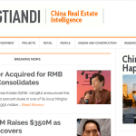
Mobile version
In addition to the desktop theme and the newsletter, some work has been done to update the site’s mobile version to match the colors of the desktop theme and to better reflect the overall branding.
Many thanks to my friend Mark Beard for the new logo and the rest of the visual identity of the site. Mark was the creative force behind the visual identity for my RightSite.asia, and takes absolutely no responsibility for the former look of Mingtiandi, which I believe I came up with while drinking beer in the sun one day.
For those of you who enjoy horror movies or watching traffic accidents, I’m also including a few screenshots of how the site looked over the last few years as it developed. (Apologies in advance for my poor design skills).
I hope you’ll enjoy the new look for the site, and please get in touch if you have questions.
-

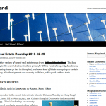
- How things looked in December 2010 — Ouch!
-
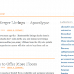
- The bad old days of April 2011
-
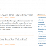
- How the site looked in December 2011
-
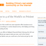
- Mingtiandi in January this year.
-
- The new look
Leave a Reply